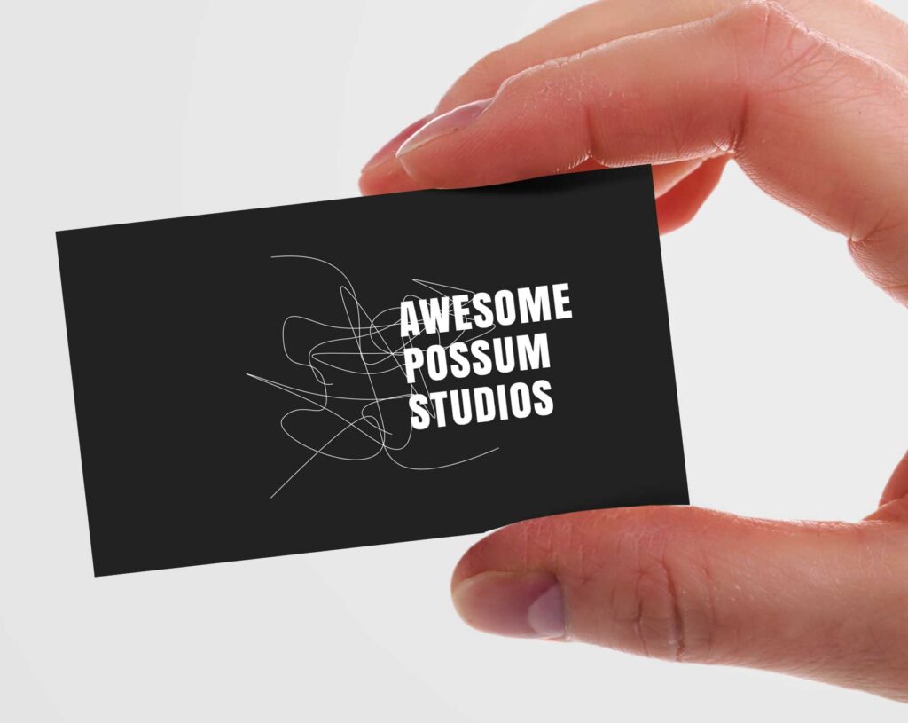
While designing your business cards, you should never forget about their primary objective. Business cards will not only help your company look professional and trustworthy, but you can easily capture the attention of potential customers and clients.
People think about many things while having a conversation and they can forget the name of the business owner or the company within a couple of seconds. Some people also receive business cards through your employees at events and trade shows without meeting you face-to-face. In such scenarios, most people won’t engage with your business until they require your services. This is why you need to provide your potential clients and customers with a solid reason to engage with your business cards.
Business cards come with limited space to showcase your skills and business offerings. Additionally, they can also create many negative opportunities if they are designed improperly. Overcoming the bad impression is a difficult task. A weak and improperly designed business card will not only look unprofessional but can also drive customers away from engaging with your company. Here are some business card designing mistakes you should avoid.
You Miss Including the Contact Information
People need a different form of contact information to get in touch with your company. Even though eye-catching business cards will undoubtedly help you capture the attention of potential clients and customers, they will throw the card away if they notice a lack of proper contact information. A business card with no contact information is useless.
Before you start focusing on the design, don’t forget to include these relevant contact details in your custom business cards:
- Name of the business
- Name of the company
- Job title and description
- Email address
- Business address
- Phone number
- Social media platforms
Include more than one contact information in your business cards. As people prefer different communication methods, adding multiple contact details will help everyone reach you easily.
The information in the Business Card is Outdated
This is one of the most common business card designing mistakes you need to avoid. Customers or clients would never track down or engage with a company that provides business cards with outdated or irrelevant information. Additionally, if you cross out some information by hand and replace it with something relevant, it will still create a bad image. No one will focus on filling the gaps when they can easily engage with your competitors. As per Business2community, sometimes your customers will choose the competitors.
Therefore, you should never use cards that are filled with outdated information. Instead, you should consider purchasing or designing new business cards. As the cards are affordable, they are a low-cost investment.
You Choose Irrelevant Color Pattern
The colors you use in your business cards will determine their effectiveness. Here are some scenarios when the color schemes will destroy the professionalism of the business cards:
- The color scheme is irrelevant as per your brand image.
- The colors decrease the legibility of the business card.
- The colors scheme is extra saturated or creates visual clutter.
Therefore, you need to pay close attention while choosing the colors for your business cards. Even though you need to focus on your brand color, you can also make some changes to improve readability.
Conclusion
These are some common mistakes you should avoid while designing business cards. If you want eye-catching and effective business cards, make sure you contact us today.

